Visualize Data with matplotlib, Seaborn, and Pandas
The goal of this module is to provide an overview of methods for graphing and visualizing data using Python. Specifically, we will investigate matplotlib. We will further explore Seaborn and Pandas, which make use of matplotlib. After working through this module, you will be able to:
- prepare data for use in a graph.
- make basic graphs using matplotlib, Seaborn, and Pandas.
- plot images using matplotlib.
- understand the differences between and how to use figures and axes or subplots.
- refine graphs using matplotlib.
- save graphics to vector or raster graphic files.
matplotlib
Preparation
As the name implies, matplotlib is based on the graphing functions available in MatLab. It allows for the generation of a wide variety of graph types and data visualizations. Further, graphs can be edited, customized, and saved using Python code.
Here is a link to the matplotlib documentation.
In order to use matplotlib, you will need to install it into your Anaconda environment. To make graphs, you will work with the pyplot module specifically, so it is common to call in that specific module and assign it an alias name. To have the graphs plot in a Jupyter Notebook, you will need to include "%maplotlib inline" in your code. You can also change default parameters. In the example below, I changed the default plot size.
import numpy as np
import pandas as pd
import matplotlib.pyplot as plt
%matplotlib inline
plt.rcParams['figure.figsize'] = [10, 8]
In order to provide examples of a wide variety of graph types, I am calling in several data sets using Pandas:
- mov: List of movies with name, director, release year, genre, my brother's rating, and whether or not my brother owns a copy.
- cnty: US county-level demographic and socioeconomic data. Data were derived from the US Census.
- hp: Environmental and climate data for counties in the high plains states. The climate data were derived from PRISM, and the land cover data were derived from the National Land Cover Database (NLCD)
- maple: Spectral reflectance data for a maple leaf at different wavelengths. Data are from the United States Geological Survey Spectral Library.
All data sets are read in as Pandas DataFrames. Also, I have removed any spaces in the column names using list comprehension.
mov = pd.read_csv("D:/mydata/matts_movies.csv", sep=",", header=0, encoding="ISO-8859-1")
mov.columns =[column.replace(" ", "_") for column in mov.columns]
print(mov.head(10))
                 Movie_Name             Director  Release_Year  My_Rating  \
0             Almost Famous        Cameron Crowe          2000       9.99
1  The Shawshank Redemption       Frank Darabont          1994       9.98
2             Groundhog Day         Harold Ramis          1993       9.96
3              Donnie Darko        Richard Kelly          2001       9.95
4           Children of Men       Alfonso Cuaron          2006       9.94
5                Annie Hall          Woody Allen          1977       9.93
6                  Rushmore         Wes Anderson          1998       9.92
7                   Memento    Christopher Nolan          2000       9.91
8    No Country for Old Men  Joel and Ethan Coen          2007       9.90
9                     Seven        David Fincher          1995       9.88

         Genre  Own
0        Drama  Yes
1        Drama  Yes
2       Comedy  Yes
3       Sci-Fi  Yes
4       Sci-Fi  Yes
5       Comedy  Yes
6  Independent  Yes
7     Thriller  Yes
8     Thriller  Yes
9     Thriller  Yes
cnty = pd.read_csv("D:/mydata/us_county_data_2.csv", sep=",", header=0, encoding="ISO-8859-1")
cnty.columns =[column.replace(" ", "_") for column in cnty.columns]
print(cnty.head(10))
  STATE    COUNTY  FIPS    winner12    winner08  per_dem  per_rep  per_other  \
0    AL   Autauga  1001  republican  republican     25.8     73.6        0.6
1    AL   Barbour  1005    democrat  republican     49.0     50.4        0.6
2    AL      Bibb  1007  republican  republican     26.6     72.4        1.0
3    AL    Blount  1009  republican  republican     14.5     84.0        1.5
4    AL   Bullock  1011    democrat    democrat     74.1     25.7        0.2
5    AL    Butler  1013  republican  republican     43.1     56.5        0.4
6    AL  Chambers  1017  republican  republican     45.5     53.9        0.6
7    AL  Cherokee  1019  republican  republican     23.7     74.9        1.5
8    AL   Chilton  1021  republican  republican     20.7     78.5        0.9
9    AL   Choctaw  1023  republican  republican     46.1     53.5        0.4

     pop_den  per_gt55  per_notw   per_vac  med_income  per_pov STATE_NAME  \
0  90.493357  0.227337  0.214693  0.086469       51622     10.7    Alabama
1  30.541693  0.274065  0.519977  0.169837       30896     24.5    Alabama
2  36.623022  0.246171  0.241501  0.114464       41076     18.5    Alabama
3  87.763061  0.274153  0.074212  0.096663       46086     13.1    Alabama
4  17.419550  0.263515  0.770295  0.166481       26980     33.6    Alabama
5  26.971125  0.301427  0.455817  0.147832       31449     22.3    Alabama
6  56.944601  0.306152  0.412188  0.180605       35614     18.7    Alabama
7  43.443497  0.329909  0.073416  0.346776       38028     17.7    Alabama
8  62.442404  0.256971  0.158788  0.141093       40292     17.1    Alabama
9  15.103838  0.323400  0.442168  0.193011       30728     22.9    Alabama

  SUB_REGION
0    E S Cen
1    E S Cen
2    E S Cen
3    E S Cen
4    E S Cen
5    E S Cen
6    E S Cen
7    E S Cen
8    E S Cen
9    E S Cen
hp = pd.read_csv("D:/mydata/high_plains_data.csv", sep=",", header=0, encoding="ISO-8859-1")
hp.columns =[column.replace(" ", "_") for column in hp.columns]
print(hp.head(10))
   GEOID10    ID             NAME_1 STATE_NAME ST_ABBREV         AREA  \
0     8053  8053    Hinsdale County   Colorado        CO  1123.212157
1     8061  8061       Kiowa County   Colorado        CO  1785.889183
2     8063  8063  Kit Carson County   Colorado        CO  2161.740894
3     8071  8071  Las Animas County   Colorado        CO  4775.291392
4     8073  8073     Lincoln County   Colorado        CO  2586.326731
5     8075  8075       Logan County   Colorado        CO  1845.045782
6     8079  8079     Mineral County   Colorado        CO   877.691373
7     8085  8085    Montrose County   Colorado        CO  2242.693513
8     8087  8087      Morgan County   Colorado        CO  1293.760087
9     8089  8089       Otero County   Colorado        CO  1269.475894

   TOTPOP10  POPDENS10  MALES10  FEMALES10  ...  TOTHH00  FAMHH00  TOTHU00  \
0       843        0.8      443        400  ...      359      247     1304
1      1398        0.8      687        711  ...      665      452      817
2      8270        3.8     4638       3632  ...     2990     2081     3430
3     15507        3.2     7948       7559  ...     6173     4095     7629
4      5467        2.1     3163       2304  ...     2058     1389     2406
5     22709       12.4    12924       9785  ...     7551     5064     8424
6       712        0.8      362        350  ...      377      251     1119
7     41276       18.4    20310      20966  ...    13043     9311    14202
8     28159       22.0    13898      14261  ...     9539     6969    10410
9     18831       14.9     9221       9610  ...     7920     5473     8813

   OWNER00  RENTER00    per_for         elev       temp      precip   precip2
0      233       126  34.962704  3334.739362   1.410638  800.246066  8.002461
1      474       191   0.002120  1269.637288  11.159492  384.201797  3.842018
2     2151       839   0.021467  1348.005495  10.179698  435.414037  4.354140
3     4360      1813  11.687193  1834.354115  10.439925  424.757731  4.247577
4     1421       637   0.043238  1564.500000   9.573578  376.228555  3.762286
5     5277      2274   0.124509  1278.251592   9.749204  425.278696  4.252787
6      279        98  38.846741  3212.506757   1.830405  856.293446  8.562934
7     9773      3270  33.571025  2122.834667   8.327253  447.202160  4.472022
8     6525      3014   0.112152  1372.481651   9.731422  369.794908  3.697949
9     5471      2449   0.024750  1355.050926  11.780972  338.015001  3.380150

[10 rows x 157 columns]
maple = pd.read_csv("D:/mydata/maple_leaf.csv", sep=",", header=0, encoding="ISO-8859-1")
maple.columns =[column.replace(" ", "_") for column in maple.columns]
print(maple.head(10))
     wav  reflec
0  0.353  0.0296
1  0.357  0.0295
2  0.361  0.0288
3  0.364  0.0289
4  0.367  0.0293
5  0.370  0.0284
6  0.373  0.0290
7  0.376  0.0285
8  0.379  0.0288
9  0.381  0.0290
Basic Graphs
Before you can create complex and well-refined graphs, you need to know the basics. In this section, my goal is to show you how to generate simple graphs using the basic matplotlib syntax.
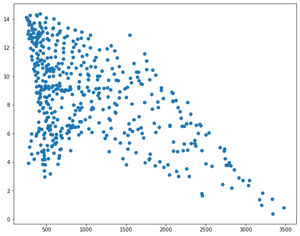
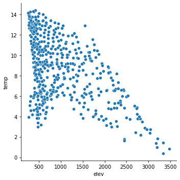
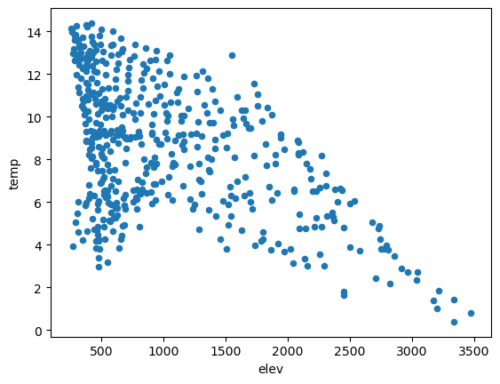
In the first example below I have produced a basic scatter plot to visualize the relationship between mean elevation and mean annual temperature at the county-level in the high plains states as an example of a bivariate graph. The first argument, elevation, is plotted to the x-axis and the second argument, temperature, is plotted to the y-axis. Here, I used dot notation; however, bracket notation is also acceptable. The graph is saved to a variable then the show() method from the pyplot module is used to plot the graph. It isn't necessary to provide the graph name as an argument as the last created graph will be plotted by default.
Although this graph is adequate to simply visualize the data and the relationship between the two variables, it is still a bit rough to include in a presentation or report. We will cover refining the output later in this module.
sp1 = plt.scatter(hp.elev, hp.temp)
#plt.scatter(hp["elev"], hp["temp"])
plt.show(sp1)
In the next example, I am generating a histogram from my brother's movie ratings. Since this is a histogram, which is a univariate graph, only one variable has to be provided.
hist1 = plt.hist(mov.My_Rating)
plt.show(hist1)
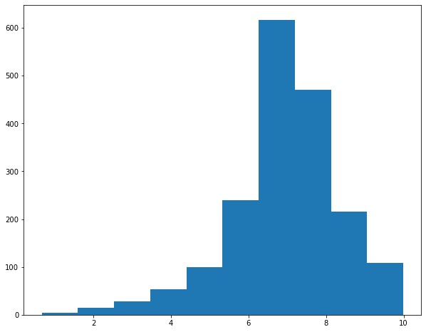
Histograms accept an additional, optional bins parameter to specify the number of data bins to include.
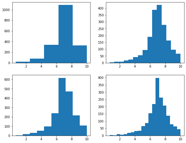
I am going to use this as an opportunity to discuss the concepts of subplots or axes in matplotlib. A figure represents the entire space in which graphs are generated. Figures are further divided into subplots or axes, which allow you to place multiple plots in the same graph space. There are multiple ways to implement this. In the example, I am creating a figure called fig1 that contains two rows and two columns. The positions of the subplots within the figure are defined relative to the rows and columns defined using indexes relative to axs, or the subplots.
So, in this example, I have placed a separate graph, representing a different bin width, in each of the four available row/column combinations.
If you do not define multiple subplots, a plot will take up the entire graph or figure space by default.
fig1, axs = plt.subplots(2,2)
axs[0,0].hist(mov.My_Rating, bins=5)
axs[1,0].hist(mov.My_Rating, bins=10)
axs[0, 1].hist(mov.My_Rating, bins=15)
axs[1, 1].hist(mov.My_Rating, bins=20)
plt.show(fig1)
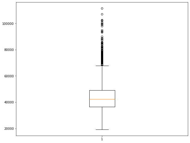
The example below shows how to generate a boxplot to visualize the distribution of a continuous variable, in this case median income by county.
bp1 = plt.boxplot(x=cnty.med_income)
plt.show(bp1)
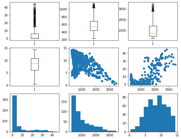
Now, let's combine a set of different graphs as a single figure using multiple subplots. Make sure you understand how indexes are used to reference each subplot within the figure.
fig1, axs = plt.subplots(3,3)
axs[0,0].boxplot(hp.per_for)
axs[0,1].boxplot(hp.precip)
axs[0,2].boxplot(hp.elev)
axs[1,0].boxplot(hp.temp)
axs[1,1].scatter(hp.elev, hp.temp)
axs[1,2].scatter(hp.elev, hp.per_for)
axs[2,0].hist(hp.per_for)
axs[2,1].hist(hp.elev)
axs[2,2].hist(hp.temp)
plt.show(fig1)
Cleaning Up Graphs
You should now have a basic understanding of how to generate simple plots using matplotlib and how to include subplots within a figure. I will now demonstrate how to improve graphs and make them suitable for presentation. There are way too many customization options to cover in detail. Instead, I will focus on some common tasks. For more details and to investigate specific options, please consult the matplotlib documentation.
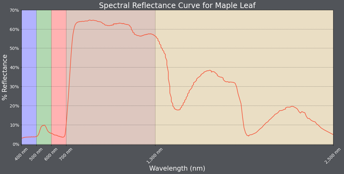
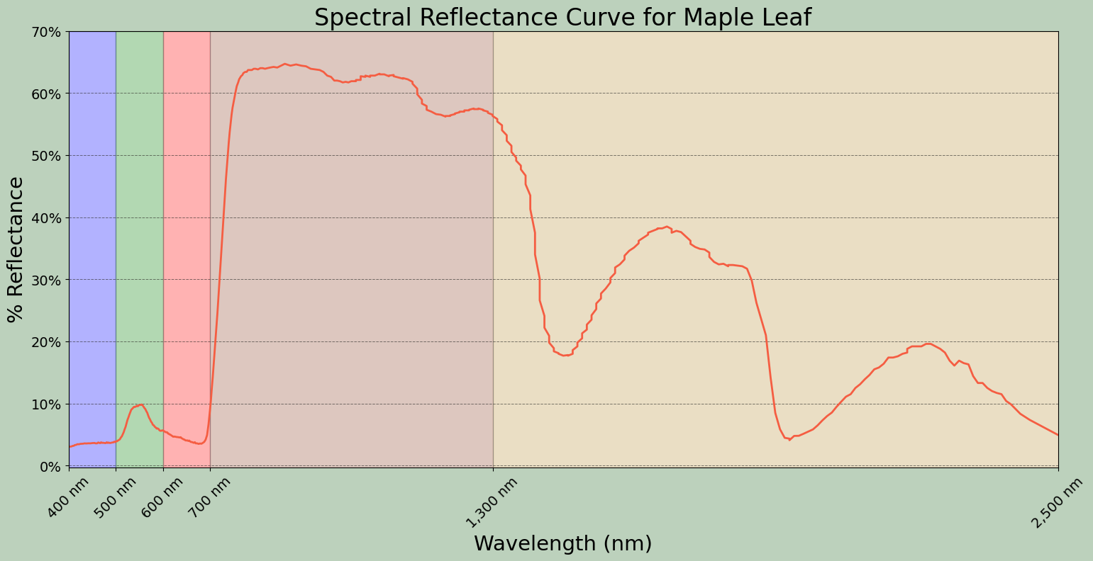
In this first example, I am making a spectral reflectance curve from the maple leaf data. Here are some notes on how this result was obtained.
- Using the subplot() method, I define a size for the figure. I also assign variable names to the figure and subplot.
- I generate the plot using the plot() method applied to the subplot variable, which generates a line graph by default. I provide the desired x and y variables, set a line color using a hex code, set a line width, and set the markers to an empty string so that no point markers are included.
- The main title, x-axis title, and y-axis title are defined and a font size and color are selected using the appropriate set methods applied to the subplot as opposed to the entire figure.
- The x-axis and y-axis ticks are set using the appropriate set method. Next, labels are defined as a list and the font size and color are set for the tick labels using another set method.
- The limits for the x-axis are defined using set_lim(). I did not set the limits for the y-axis since the defaults are adequate.
- The x-axis tick labels are rotated by 45-degrees to minimize overprinting.
- I want to highlight the spectral ranges using different fill colors. To accomplish this, I use the axvspan() method and set the range and desired color. The alpha parameter is used to add transparency. Note that axhspan() can be used to fill ranges of y.
- I add separate x- and y-grids using the grid() method. These grids are customized by changing the color, transparency, line style, and line width.
- I change the figure background color using the patch.set_facecolor() method.
The documentation for matplotlib and associated methods explain what style parameters are available for customization. I would suggest experimenting with this code to further manipulate and change the figure.
fig, ax = plt.subplots(figsize=(18, 8))
ax.plot(maple.wav, maple.reflec, color="#f55d42", linewidth=2, marker="")
ax.set_title("Spectral Reflectance Curve for Maple Leaf", fontsize=24, color="#ffffff")
ax.set_xlabel("Wavelength (nm)", fontsize= 21, color="#ffffff")
ax.set_ylabel("% Reflectance", fontsize=21, color="#ffffff")
ax.set_yticks([0, .1, .2, .3, .4, .5, .6, .7])
ax.set_yticklabels(["0%", "10%", "20%", "30%", "40%", "50%", "60%", "70%"], fontsize=14, color="#ffffff")
ax.set_xlim(0.4, 2.5)
ax.set_xticks([0.4, 0.5, 0.6, 0.7, 1.3, 2.5])
ax.set_xticklabels(["400 nm", "500 nm", "600 nm", "700 nm", "1,300 nm", "2,500 nm"], fontsize=14, rotation=45, color="#ffffff")
ax.axvspan(.4, .5, color='blue', alpha=0.3)
ax.axvspan(.5, .6, color='green', alpha=0.3)
ax.axvspan(.6, .7, color='red', alpha=0.3)
ax.axvspan(.7, 1.3, color='#91482D', alpha=0.3)
ax.axvspan(1.3, 3, color='#BA943C', alpha=0.3)
ax.grid(color='#79818f', alpha=0.6, linestyle='solid', linewidth=0.7, axis='x')
ax.grid(color='#2B2A27', alpha=0.6, linestyle='dashed', linewidth=0.7, axis='y')
fig.patch.set_facecolor('#515459')
plt.show(fig)
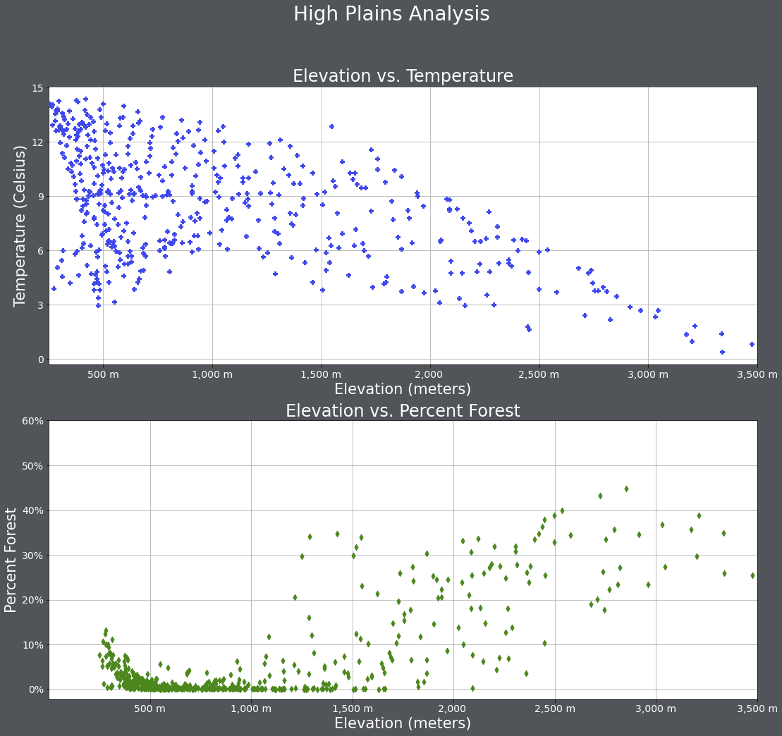
Below is another example. Have a look at the code and make sure you understand how the figure and subplots were generated.
One change I made here was to provide arguments for the zorder parameter so that the data points plot above the grid lines. In matplotlib, zorder is commonly used to define custom drawing order.
fig1, axs = plt.subplots(2,1, figsize=(18,16))
fig1.suptitle('High Plains Analysis', fontsize=28, color="#ffffff")
axs[0].scatter(hp.elev, hp.temp, color="#3f48eb", marker="P", zorder=10)
axs[0].set_title("Elevation vs. Temperature", fontsize=24, color="#ffffff")
axs[0].set_xlabel("Elevation (meters)", fontsize= 21, color="#ffffff")
axs[0].set_ylabel("Temperature (Celsius)", fontsize=21, color="#ffffff")
axs[0].set_yticks([0, 3, 6, 9, 12, 15])
axs[0].set_yticklabels([0, 3, 6, 9, 12, 15], fontsize=14, color="#ffffff")
axs[0].set_xlim(250, 3500)
axs[0].set_xticks([500, 1000, 1500, 2000, 2500, 3000, 3500])
axs[0].set_xticklabels(["500 m", "1,000 m", "1,500 m", "2,000 ", "2,500 m", "3,000 m", "3,500 m"], fontsize=14, color="#ffffff")
axs[0].grid(True, zorder=0)
axs[1].scatter(hp.elev, hp.per_for, color="#4b871c", marker="d", zorder=10)
axs[1].set_title("Elevation vs. Percent Forest", fontsize=24, color="#ffffff")
axs[1].set_xlabel("Elevation (meters)", fontsize= 21, color="#ffffff")
axs[1].set_ylabel("Percent Forest", fontsize=21, color="#ffffff")
axs[1].set_yticks([0, 10, 20, 30, 40, 50, 60])
axs[1].set_yticklabels(["0%", "10%", "20%", "30%", "40%", "50%", "60%"], fontsize=14, color="#ffffff")
axs[1].set_xlim(0, 3500)
axs[1].set_xticks([500, 1000, 1500, 2000, 2500, 3000, 3500])
axs[1].set_xticklabels(["500 m", "1,000 m", "1,500 m", "2,000 ", "2,500 m", "3,000 m", "3,500 m"], fontsize=14, color="#ffffff")
axs[1].grid(True, zorder=0)
fig1.patch.set_facecolor('#515459')
plt.show(fig1)
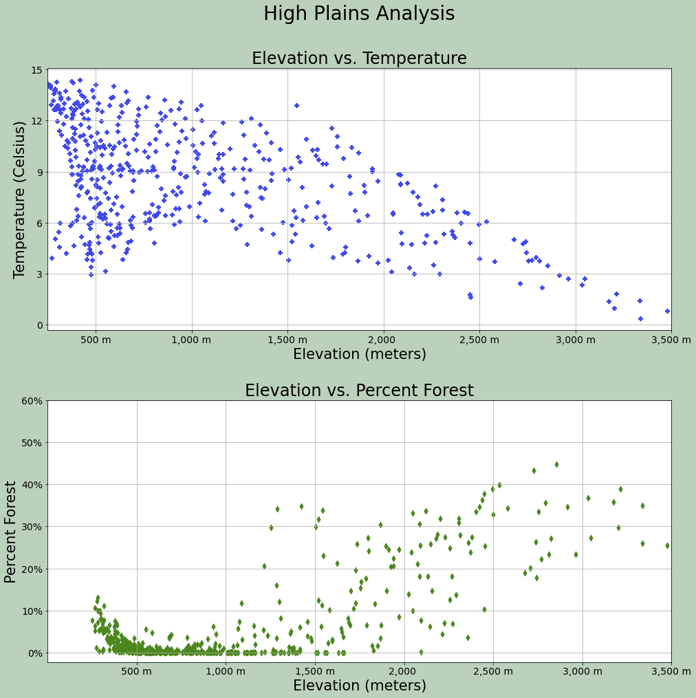
Spacing within the figure and between subplots can be manipulated using a variety of methods. subplots_adjust() is used to add space between the subplots and margin of the figure while tight_layout() is used to change the spacing between subplots.
As already mentioned, the background color of the figure can be changed with patch.set_facecolor().
fig1, axs = plt.subplots(2,1, figsize=(18,16))
fig1.suptitle('High Plains Analysis', fontsize=28, color="#000000")
axs[0].scatter(hp.elev, hp.temp, color="#3f48eb", marker="P")
axs[0].set_title("Elevation vs. Temperature", fontsize=24, color="#000000")
axs[0].set_xlabel("Elevation (meters)", fontsize= 21, color="#000000")
axs[0].set_ylabel("Temperature (Celsius)", fontsize=21, color="#000000")
axs[0].set_yticks([0, 3, 6, 9, 12, 15])
axs[0].set_yticklabels([0, 3, 6, 9, 12, 15], fontsize=14, color="#000000")
axs[0].set_xlim(250, 3500)
axs[0].set_xticks([500, 1000, 1500, 2000, 2500, 3000, 3500])
axs[0].set_xticklabels(["500 m", "1,000 m", "1,500 m", "2,000 ", "2,500 m", "3,000 m", "3,500 m"], fontsize=14, color="#000000")
axs[0].grid(True)
axs[1].scatter(hp.elev, hp.per_for, color="#4b871c", marker="d")
axs[1].set_title("Elevation vs. Percent Forest", fontsize=24, color="#000000")
axs[1].set_xlabel("Elevation (meters)", fontsize= 21, color="#000000")
axs[1].set_ylabel("Percent Forest", fontsize=21, color="#000000")
axs[1].set_yticks([0, 10, 20, 30, 40, 50, 60])
axs[1].set_yticklabels(["0%", "10%", "20%", "30%", "40%", "50%", "60%"], fontsize=14, color="#000000")
axs[1].set_xlim(0, 3500)
axs[1].set_xticks([500, 1000, 1500, 2000, 2500, 3000, 3500])
axs[1].set_xticklabels(["500 m", "1,000 m", "1,500 m", "2,000 ", "2,500 m", "3,000 m", "3,500 m"], fontsize=14, color="#000000")
axs[1].grid(True)
fig1.patch.set_facecolor('#bcd1bc')
fig1.tight_layout(h_pad = 5)
fig1.subplots_adjust(left=0.15, right=.85, bottom=0.15, top=0.90);
plt.show(fig1)
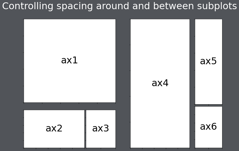
What if you want to design a grid of subplots that don't use regularly spaced rows and columns? This can be accomplished using the GridSpec method from the gridspec module of the matplotlib library.
The example below was manipulated from the matplotlib documentation at this link. Here is an explanation of this figure:
- A function is defined to label each subplot.
- A figure is generated using the figure() method and a title is added using suptitle.
- The figure is broken into two grids. gs1 is the left part of the figure from 0.05 to 0.48. Also, a width of 0.05 has been defined to add space between subplots. gs2 is the right side of the figure from 0.55 to 0.98. Horizontal space between subplots has been defined.
- Both grids have been divided into subplots, with the position defined using bracket notation.
- ax1: All 3 columns, first 2 rows of gs1
- ax2: First two columns, last row of gs1
- ax3: Last column, last row of gs1
- ax4: First two columns, all rows of gs2
- ax5: Last column, first two rows of gs2
- ax6: Last column, last row of gs2
import matplotlib.pyplot as plt
from matplotlib.gridspec import GridSpec

def annotate_axes(fig):
    for i, ax in enumerate(fig.axes):
        ax.text(0.5, 0.5, "ax%d" % (i+1), va="center", ha="center", fontsize=32)
        ax.tick_params(labelbottom=False, labelleft=False)

fig = plt.figure()
fig.suptitle("Controlling spacing around and between subplots", fontsize=32, color="#ffffff")

gs1 = GridSpec(3, 3, left=0.05, right=0.48, wspace=0.05)
ax1 = fig.add_subplot(gs1[0:2, :])
ax2 = fig.add_subplot(gs1[2, 0:2])
ax3 = fig.add_subplot(gs1[2, 2])

gs2 = GridSpec(3, 3, left=0.55, right=0.98, hspace=0.05)
ax4 = fig.add_subplot(gs2[:, 0:2])
ax5 = fig.add_subplot(gs2[0:2, 2])
ax6 = fig.add_subplot(gs2[2, 2])

annotate_axes(fig)
fig.patch.set_facecolor('#515459')
plt.show()
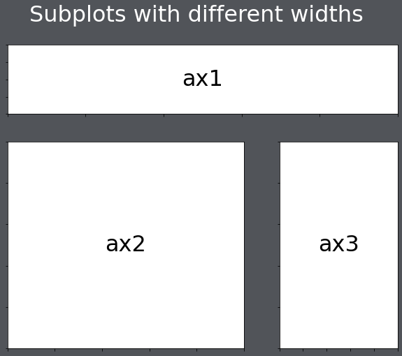
You can also change the height and width ratios of the grids using the height_ratios and width_ratios parameters.
import matplotlib.pyplot as plt
from matplotlib.gridspec import GridSpec

def annotate_axes(fig):
    for i, ax in enumerate(fig.axes):
        ax.text(0.5, 0.5, "ax%d" % (i+1), va="center", ha="center", fontsize=32)
        ax.tick_params(labelbottom=False, labelleft=False)

fig = plt.figure()
fig.suptitle("Subplots with different widths", fontsize=32, color="#ffffff")

gs1 = GridSpec(2, 2, width_ratios=[2,1], height_ratios=[1, 3])
ax1 = fig.add_subplot(gs1[0:1, :])
ax2 = fig.add_subplot(gs1[1, 0:1])
ax3 = fig.add_subplot(gs1[1, 1])

annotate_axes(fig)
fig.patch.set_facecolor('#515459')
plt.show()
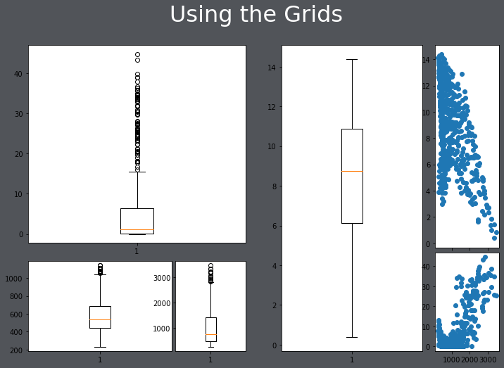
In the code below, I have filled the grids with some subplots. These don't look great; they are just meant as an example.
import matplotlib.pyplot as plt
from matplotlib.gridspec import GridSpec

fig = plt.figure()
fig.suptitle("Using the Grids", fontsize=32, color="#ffffff")

gs1 = GridSpec(3, 3, left=0.05, right=0.48, wspace=0.05)
ax1 = fig.add_subplot(gs1[0:2, :])
ax2 = fig.add_subplot(gs1[2, 0:2])
ax3 = fig.add_subplot(gs1[2, 2])

gs2 = GridSpec(3, 3, left=0.55, right=0.98, hspace=0.05)
ax4 = fig.add_subplot(gs2[:, 0:2])
ax5 = fig.add_subplot(gs2[0:2, 2])
ax6 = fig.add_subplot(gs2[2, 2])

ax1.boxplot(hp.per_for)
ax2.boxplot(hp.precip)
ax3.boxplot(hp.elev)
ax4.boxplot(hp.temp)
ax5.scatter(hp.elev, hp.temp)
ax6.scatter(hp.elev, hp.per_for)
fig.patch.set_facecolor('#515459')
plt.show()
Plotting Images
Matplotlib can also be used to display or plot images using the imshow() method. In the example below, I am reading in an image using the cv2 library. Since this library reads the image in using a different band order than matplotlib expects, I use the .cvtColor() function to change the band order. I also turn off the axes tick labels.
from matplotlib import pyplot as plt
import cv2

img = cv2.imread("D:/mydata/WaterValve.jpg")
plt.imshow(cv2.cvtColor(img, cv2.COLOR_BGR2RGB))
plt.axis("off")
plt.show()
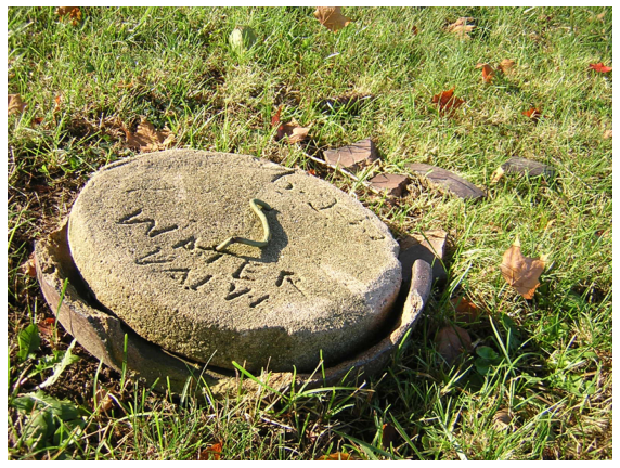
Below, I am using subplots to display copies of the image as subplots within a figure.
You will see more examples of reading in and plotting image data in later modules.
from matplotlib import pyplot as plt
import cv2

img = cv2.imread("D:/mydata/WaterValve.jpg")

plt.rcParams['figure.figsize'] = [10, 8]
fig1, axs = plt.subplots(2,2)
axs[0,0].imshow(cv2.cvtColor(img, cv2.COLOR_BGR2RGB))
axs[0,0].axis("off")
axs[1,0].imshow(cv2.cvtColor(img, cv2.COLOR_BGR2RGB))
axs[1,0].axis("off")
axs[0,1].imshow(cv2.cvtColor(img, cv2.COLOR_BGR2RGB))
axs[0,1].axis("off")
axs[1,1].imshow(cv2.cvtColor(img, cv2.COLOR_BGR2RGB))
axs[1,1].axis("off")
fig1.tight_layout(h_pad = .5, w_pad = .5)
fig1.patch.set_facecolor('#515459')
plt.show()

Seaborn
Seaborn is a Python library that is based on matplotlib and simplifies the generation of a variety of graph types and data visualizations. It is also an easier means to interact with matplotlib. The goal of this section is to demonstrate the generation of a variety of different graph types using Seaborn. Here is a link to the Seaborn documentation.
To use Seaborn you will need to install it into your Python environment. You will then need to import it into your script.
import seaborn as sns
The relplot() method can be used to generate a scatterplot. Values are mapped to variables relative to a data argument.
sns.relplot(x="elev", y="temp", data=hp)
<seaborn.axisgrid.FacetGrid at 0x23d20c4fee0>
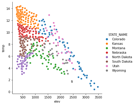
It is possible to map variables to other graphical parameters, other than just the position along the x-axis and y-axis. In this example, I have mapped the state to the point color as a nominal or categorical variable using the hue parameter. Seaborn automatically chooses unordered colors, or a qualitative color scheme.
sns.relplot(x="elev", y="temp", hue="STATE_NAME", data=hp)
<seaborn.axisgrid.FacetGrid at 0x23d21404340>
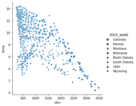
In contrast to the last example, I have now mapped the state name to the point symbol or style as opposed to the color or hue. Mapping to the point symbol would not make sense for a continuous variable, since there is no implied order for symbols. However, a continuous variable could be mapped to the symbol color or size.
sns.relplot(x="elev", y="temp", style="STATE_NAME", data=hp)
<seaborn.axisgrid.FacetGrid at 0x23d2149e3d0>
In order to refine or improve Seaborn plots you can use methods made available by Seaborn and/or methods made available by matplotlib, since Seaborn is built on top of matplotlib. Here, I have mainly focused on using matplotlib since we have already discussed these methods above.
One complexity is that some Seaborn graphs are produced as a FacetGrid object and cannot be placed into a subplot within a figure. relplot() is an example. Other plot methods generate the data at an axes or subplot level, such as scatterplot(). Here, I will focus on manipulating graphs that can be treated as subplots. To accomplish this, a figure is generated and a Seaborn graph is then mapped to one of the axes. Then, matplotlib can be used to alter the Seaborn graph.
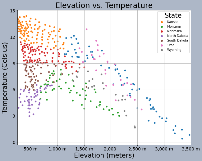
How do you place a Seaborn graph into a subplot within a figure? This is accomplished using the ax parameter and assigning the Seaborn graph to a named axis or by using bracket notation. In the example, there is only one subplot in the figure, so I can just use the subplot name.
fig, axs = plt.subplots(1, 1)
sns.scatterplot(ax=axs, x="elev", y="temp", hue="STATE_NAME", data=hp)
axs.set_title("Elevation vs. Temperature", fontsize=24, color="#000000")
handles, labels = axs.get_legend_handles_labels()
axs.legend(handles=handles[1:], labels=labels[1:], title="State", title_fontsize=21)
axs.set_title("Elevation vs. Temperature", fontsize=24, color="#000000")
axs.set_xlabel("Elevation (meters)", fontsize= 21, color="#000000")
axs.set_ylabel("Temperature (Celsius)", fontsize=21, color="#000000")
axs.set_yticks([0, 3, 6, 9, 12, 15])
axs.set_yticklabels([0, 3, 6, 9, 12, 15], fontsize=14, color="#000000")
axs.set_xlim(250, 3500)
axs.set_xticks([500, 1000, 1500, 2000, 2500, 3000, 3500])
axs.set_xticklabels(["500 m", "1,000 m", "1,500 m", "2,000 ", "2,500 m", "3,000 m", "3,500 m"], fontsize=14, color="#000000")
axs.grid(True)
fig.patch.set_facecolor('#adb7c7')
plt.show(fig)
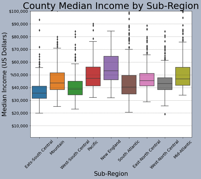
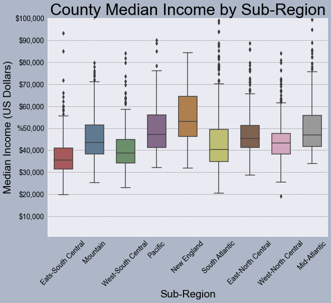
This is another example of graph editing using matplotlib methods applied to a Seaborn graph stored as a subplot in a figure. Again, the graph is assigned to a subplot within the figure. Here, I am specifically producing a boxplot broken into groups defined by a categorical or nominal variable.
fig, axs = plt.subplots(1, 1)
sns.boxplot(ax=axs, x="SUB_REGION", y="med_income", data=cnty)
axs.set_title("County Median Income by Sub-Region", fontsize=32, color="#000000")
axs.set_xlabel("Sub-Region", fontsize= 21, color="#000000")
axs.set_ylabel("Median Income (US Dollars)", fontsize=21, color="#000000")
axs.set_ylim(1000, 10000)
axs.set_yticks([10000, 20000, 30000, 40000, 50000, 60000, 70000, 80000, 90000, 100000])
axs.set_yticklabels(["$10,000", "$20,000", "$30,000", "$40,000", "%50,000", "$60,000", "$70,000", "$80,000", "$90,000", "$100,000"], fontsize=14, color="#000000")
axs.set_xticklabels(["Eats-South Central", "Mountain", "West-South Central", "Pacific", "New England", "South Atlantic", "East-North Central",
                     "West-North Central", "Mid-Atlantic"], fontsize=14, color="#000000", rotation=45)
axs.grid(color='#2B2A27', alpha=0.6, linestyle='dashed', linewidth=0.7, axis='y')
fig.patch.set_facecolor('#adb7c7')
plt.show(fig)
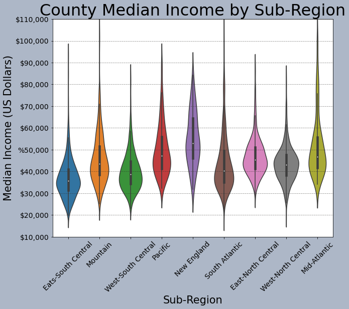
This is another example of comparing groups. However, I am using a violin plot as opposed to a boxplot.
fig, axs = plt.subplots(1, 1)
sns.violinplot(ax=axs, x="SUB_REGION", y="med_income", data=cnty)
axs.set_title("County Median Income by Sub-Region", fontsize=32, color="#000000")
axs.set_xlabel("Sub-Region", fontsize= 21, color="#000000")
axs.set_ylabel("Median Income (US Dollars)", fontsize=21, color="#000000")
axs.set_ylim(10000, 100000)
axs.set_yticks([10000, 20000, 30000, 40000, 50000, 60000, 70000, 80000, 90000, 100000, 110000])
axs.set_yticklabels(["$10,000", "$20,000", "$30,000", "$40,000", "%50,000", "$60,000", "$70,000", "$80,000", "$90,000", "$100,000", "$110,000"], fontsize=14, color="#000000")
axs.set_xticklabels(["Eats-South Central", "Mountain", "West-South Central", "Pacific", "New England", "South Atlantic", "East-North Central",
                     "West-North Central", "Mid-Atlantic"], fontsize=14, color="#000000", rotation=45)
axs.grid(color='#2B2A27', alpha=0.6, linestyle='dashed', linewidth=0.7, axis='y')
fig.patch.set_facecolor('#adb7c7')
plt.show(fig)
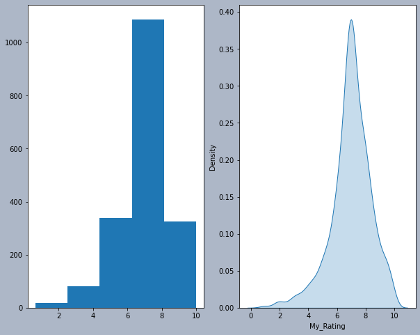
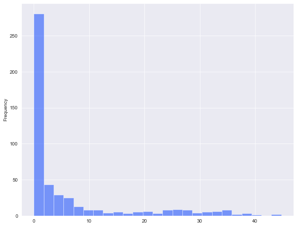
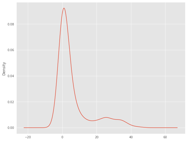
This example shows a histogram and a kernel density plot produced side-by-side as two separate subplots within a figure. Make sure you understand how each plot was assigned to the specific subplot.
fig1, axs = plt.subplots(1,2)
axs[0].hist(mov.My_Rating, bins=5)
sns.kdeplot(ax=axs[1], data=mov.My_Rating, shade=True, legend=False)
fig1.patch.set_facecolor('#adb7c7')
plt.show(fig1)
Seaborn does have some built-in color palettes and styles that can be applied. Here, I am using the "bright" palette and the "darkgrid" style.
sns.set_palette("bright")
sns.set_style("darkgrid")
fig, axs = plt.subplots(1, 1)
sns.boxplot(ax=axs, x="SUB_REGION", y="med_income", data=cnty)
axs.set_title("County Median Income by Sub-Region", fontsize=32, color="#000000")
axs.set_xlabel("Sub-Region", fontsize= 21, color="#000000")
axs.set_ylabel("Median Income (US Dollars)", fontsize=21, color="#000000")
axs.set_ylim(1000, 10000)
axs.set_yticks([10000, 20000, 30000, 40000, 50000, 60000, 70000, 80000, 90000, 100000])
axs.set_yticklabels(["$10,000", "$20,000", "$30,000", "$40,000", "%50,000", "$60,000", "$70,000", "$80,000", "$90,000", "$100,000"], fontsize=14, color="#000000")
axs.set_xticklabels(["Eats-South Central", "Mountain", "West-South Central", "Pacific", "New England", "South Atlantic", "East-North Central",
                     "West-North Central", "Mid-Atlantic"], fontsize=14, color="#000000", rotation=45)
axs.grid(color='#2B2A27', alpha=0.6, linestyle='dashed', linewidth=0.7, axis='y')
fig.patch.set_facecolor('#adb7c7')
plt.show(fig)
You can also define your own color palettes or access existing color palettes as demonstrated below. In this example, I have specified colors to use to fill the boxplots.
fig, axs = plt.subplots(1, 1)
sns.boxplot(ax=axs, x="SUB_REGION", y="med_income", data=cnty, hue="SUB_REGION", palette=sns.color_palette("Set1", n_colors=9, desat=.5), width=.6, dodge=False)
axs.get_legend().set_visible(False)
axs.set_title("County Median Income by Sub-Region", fontsize=32, color="#000000")
axs.set_xlabel("Sub-Region", fontsize= 21, color="#000000")
axs.set_ylabel("Median Income (US Dollars)", fontsize=21, color="#000000")
axs.set_ylim(1000, 10000)
axs.set_yticks([10000, 20000, 30000, 40000, 50000, 60000, 70000, 80000, 90000, 100000])
axs.set_yticklabels(["$10,000", "$20,000", "$30,000", "$40,000", "%50,000", "$60,000", "$70,000", "$80,000", "$90,000", "$100,000"], fontsize=14, color="#000000")
axs.set_xticklabels(["Eats-South Central", "Mountain", "West-South Central", "Pacific", "New England", "South Atlantic", "East-North Central",
                     "West-North Central", "Mid-Atlantic"], fontsize=14, color="#000000", rotation=45)
axs.grid(color='#2B2A27', alpha=0.6, linestyle='dashed', linewidth=0.7, axis='y')
fig.patch.set_facecolor('#adb7c7')
plt.show(fig)
Pandas
Another option for generating graphs is to make use of the graphing functionality built into Pandas. Similar to Seaborn, this is based on matplotlib. We will not discuss graphing with Pandas in detail. However, I do want to introduce it.
In the example below, I am creating a simple histogram for the high plains percent forest data. I define a bin width and a transparency. Note the use of methods in the syntax.
The documentation for the data visualization components of Pandas can be found here.
hp.per_for.plot.hist(alpha=0.5,bins=25)
<AxesSubplot:ylabel='Frequency'>
Pandas and matplotlib include some default styles. In the example below, I am using the "ggplot" style based on the ggplot2 R package. Note that the default style can be restored using "default".
plt.style.use("ggplot")
hp.per_for.plot.kde()
plt.style.use('default')
This is an example of a scatterplot. Instead of calling a method relative to a specific variable, the x and y values are defined relative to variables stored in a DataFrame.
hp.plot.scatter(x='elev',y='temp')
<AxesSubplot:xlabel='elev', ylabel='temp'>
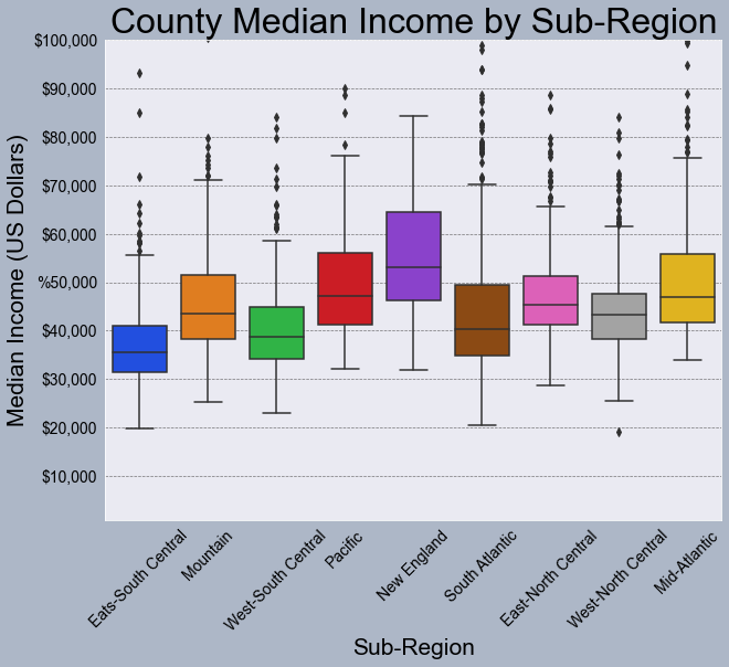
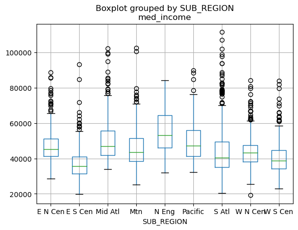
This is an example of a boxplot generated using Pandas. The by argument defines the grouping variable (the sub-region of the country in this case).
cnty.boxplot(column='med_income', by='SUB_REGION')
<AxesSubplot:title={'center':'med_income'}, xlabel='SUB_REGION'>
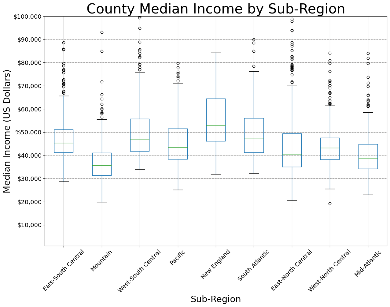
Similar to Seaborn, Pandas plots can be customized and edited using matplotlib. In the example below, I am generating a figure with one subplot. I then save the Pandas boxplot to the subplot to perform and apply the edits. You can also customize using Pandas, but I want to stick with matplotlib here for consistency.
plt.rcParams['figure.figsize'] = [14, 10]
fig, axs = plt.subplots(1, 1)
axs = cnty.boxplot(ax=axs, by="SUB_REGION", column="med_income")
axs.set_title("County Median Income by Sub-Region", fontsize=32, color="#000000")
axs.set_xlabel("Sub-Region", fontsize= 21, color="#000000")
axs.set_ylabel("Median Income (US Dollars)", fontsize=21, color="#000000")
axs.set_ylim(1000, 10000)
axs.set_yticks([10000, 20000, 30000, 40000, 50000, 60000, 70000, 80000, 90000, 100000])
axs.set_yticklabels(["$10,000", "$20,000", "$30,000", "$40,000", "%50,000", "$60,000", "$70,000", "$80,000", "$90,000", "$100,000"], fontsize=14, color="#000000")
axs.set_xticklabels(["Eats-South Central", "Mountain", "West-South Central", "Pacific", "New England", "South Atlantic", "East-North Central",
                     "West-North Central", "Mid-Atlantic"], fontsize=14, color="#000000", rotation=45)
axs.grid(color='#2B2A27', alpha=0.6, linestyle='dashed', linewidth=0.7, axis='y')
plt.suptitle("")
plt.show(fig)
Export Graphics
Once a graph is produced using matplotlib, Seaborn, and/or Pandas, it can be exported using the savefig() method from matplotlib. In the example below, I have demonstrated exporting to a vector format (SVG) and a raster format (PNG). You may find that you need to do additional editing to further refine a graph. This can best be accomplished using a vector graphics editing software, such as Adobe Illustrator or the free and open-source Inkscape software. If you do plan on doing such editing, it is generally best to save to a vector graphic file as opposed to a raster format. PDF files can also be imported into vector graphics software.
I have generally found that it is best to save the figure before using the plt.show() function to display it on the screen, as this seems to impact the rendering sometimes.
There are a variety of export options. I recommend reading through the documentation for savefig().
fig, ax = plt.subplots(figsize=(18, 8))
ax.plot(maple.wav, maple.reflec, color="#f55d42", linewidth=2, marker="")
ax.set_title("Spectral Reflectance Curve for Maple Leaf", fontsize=24)
ax.set_xlabel("Wavelength (nm)", fontsize= 21)
ax.set_ylabel("% Reflectance", fontsize=21)
ax.set_yticks([0, .1, .2, .3, .4, .5, .6, .7])
ax.set_yticklabels(["0%", "10%", "20%", "30%", "40%", "50%", "60%", "70%"], fontsize=14)
ax.set_xlim(0.4, 2.5)
ax.set_xticks([0.4, 0.5, 0.6, 0.7, 1.3, 2.5])
ax.set_xticklabels(["400 nm", "500 nm", "600 nm", "700 nm", "1,300 nm", "2,500 nm"], fontsize=14, rotation=45)
ax.axvspan(.4, .5, color='blue', alpha=0.3)
ax.axvspan(.5, .6, color='green', alpha=0.3)
ax.axvspan(.6, .7, color='red', alpha=0.3)
ax.axvspan(.7, 1.3, color='#91482D', alpha=0.3)
ax.axvspan(1.3, 3, color='#BA943C', alpha=0.3)
ax.grid(color='#79818f', alpha=0.6, linestyle='solid', linewidth=0.7, axis='x')
ax.grid(color='#2B2A27', alpha=0.6, linestyle='dashed', linewidth=0.7, axis='y')
fig.patch.set_facecolor('#bcd1bc')

plt.savefig("D:/maple_src.svg", dpi=300, format="svg")
plt.savefig("D:/maple_src.png", dpi=300, format="png")
Concluding Remarks
Data visualization and graphing using Python is a broad topic. My goal here was to provide an introduction and demonstrate how to produce a variety of different graph types and edit them to obtain the desired output. If you would like to experiment further with data visualization in Python, have a look at the matplotlib, Seaborn, and Pandas documentations. There are a wide variety of examples and tutorials available online.